

ECLECTIC MEDIA
UX Design | Mobile and Desktop view of a t-shirt customization website for end users
Project Overview
Background
For my second case study project in the Google UX Design Course, I designed a t-shirt customization website tailored for both desktop and mobile views. I utilized the graceful degradation approach, beginning with the design for desktop views before transitioning to the mobile view.
Throughout the project, my primary focus was to ensure alignment between the needs of potential clients and users, while achieving accessibility for both web and mobile platforms. I conducted thorough research to identify key factors that would enhance the user experience, making it easier for users to design their t-shirts, while also ensuring that potential clients had access to all necessary information to meet user expectations.
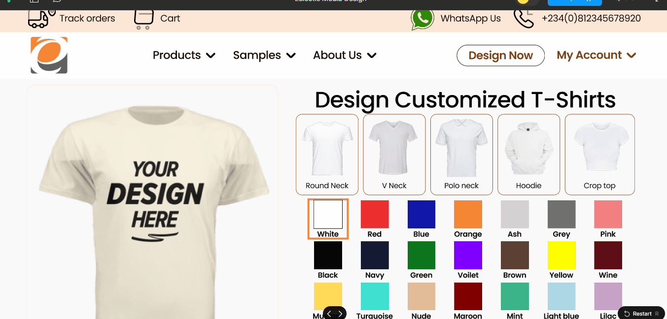
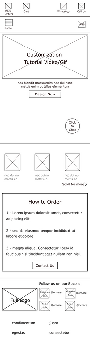
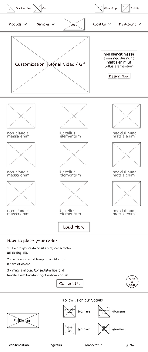
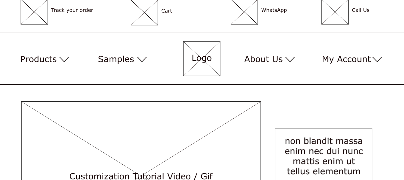
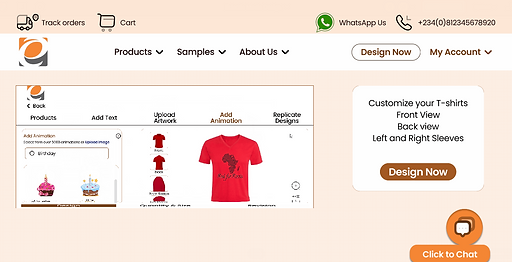
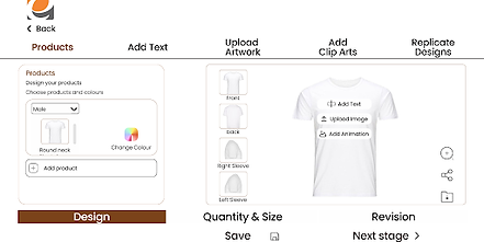
The High Fidelity Prototype for Desktop View
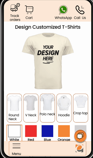
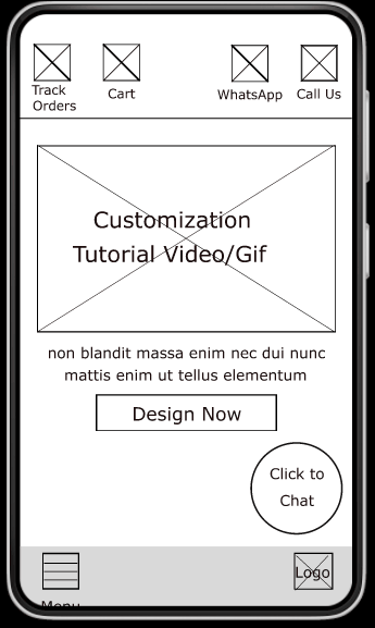
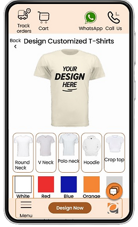
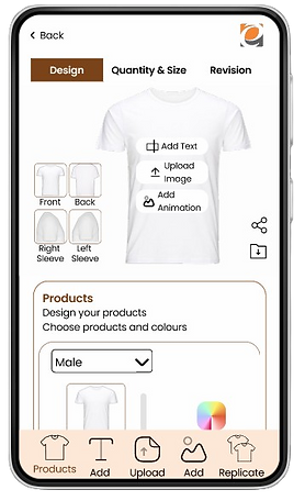
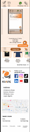
The High Fidelity Prototype for Mobile View
My Role
User Experience
Designer and Researcher
Responsibilities
Conducting Interviews
Building Wireframes
(paper, digital, low and high fidelity)
Organizing sitemaps
Prototyping
Conducting usability studies
Iteration
Tools Used
Figma
Fig Jam
Google Doc
Google Sheet
Google Slides
Timeline
November 13th, 2023
to December 22nd, 2024
Techniques Used
UX Laws Application
Design System
(Colors, Typography, Grids, Input Field )
Design Thinking Process
Competitive Audit
User Story, Problem Statement
Goal Statement, User Persona
User Journey Map,
Wireframing, Prototyping
Usability Testing
Summary
The Problem:
-
The need to first design the graphics for a customized T-Shirt then look for good quality T-Shirts that they will be printed on (including the test printing), and
2 The back-and-forth process of conversing with a T-shirt customizer is a little stressful. There should be a simpler way.
The Pain Points:
1 Navigation - The Navigation of most shirt customization websites are limited, There needs to be more functional provisions to express expectations
2 Experience - Shirt Customization websites are often limited as the process usually ends with contacting the vendor for further engagement
3 Interaction- There is usually no provision to share a brief or express the vision of what the target users want
The Solution:
Design a T-shirt customization website that allows users to Design the front, back and sleeve views of different types of T-shirts.
The Journey
This project commenced with secondary research in the form of a Competitive Audit analyzing comparing 4 t-shirt customization service providers which were Printivo (Direct Competition), Rushordertees (Direct Competition), Stickermule (Direct Competition) and Canva (Indirect Competition).
- The General Information (Competitor type, Location(s), Product offering, Price, Website, Business size, Target audience, and Unique value proposition)
- First Impressions (Desktop website experience and App or mobile website experience)
-Interactions (Features, Accessibility, User flow and Navigation)
- Visual Design (Brand Identity)
- Content (Tone and Descriptiveness)
For more details on the Competitive analysis, please follow the link - https://docs.google.com/spreadsheets/d/1omh-sRw9tvDQiAEIi2wFeZjYAl8obs7o8EUNC9aHPTA/edit?usp=sharing
Research Questions:
How easy is it to customize a t-shirt and get what is desired?
How long does it take for customers to order a t-shirt design and get the desired design, volume and size?
Is there any process of getting some customized t-shirts that is difficult?
Research Methodology and Recruitment:
10/15 minutes per participants
5 participants - 2 Males, 3 Females between the ages 25 and 55, 5 Nigeria (all remote).
Unmoderated Usability Study
Users were asked to perform tasks initially in a low-fidelity prototype and eventually in a high-fidelity prototype
Understanding the user
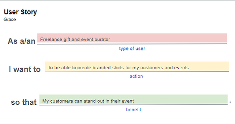
User Story

Problem Statement


Goal Statement

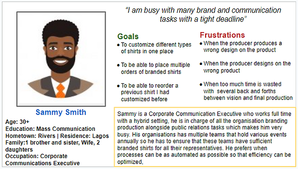
Persona based on research results
User Journey Map

Starting The Design
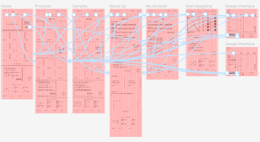
Site Map
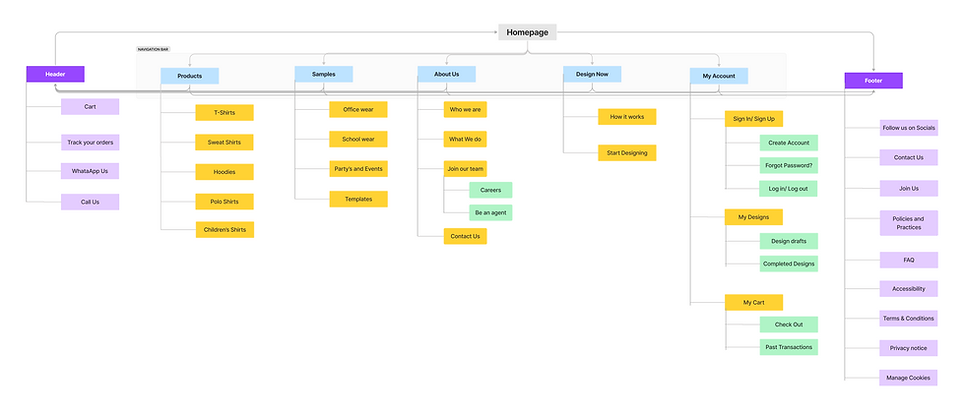
Paper wireframe screen size variations
The customers of Eclectic Shirt make use of different devices to access the website as a result I began designing for more screen sizes to ensure that the website is fully responsive
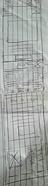
Desktop Paper Wireframe


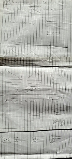
Mobile Paper Wireframe
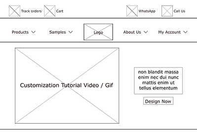
Digital Wireframe
Transferring the paper wireframes to digital enabled me to realise how redesigning could assist in directing the user pain points and enhance the user experience. One of my important strategy was to prioritize the position of useful buttons and visual element on the homepage
Video demonstrating the process of navigating the design page to personalize your shirt.
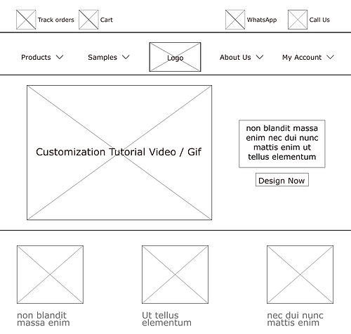
Easy access to menu navigations
Digital wireframe screen size variation(s)

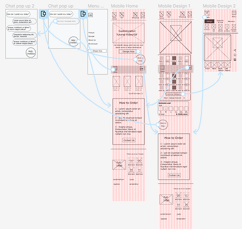
Low Fidelity Prototype
In creating the low-fidelity prototype, all the screens along the primary user flow were linked with the Design page.
At this stage, I got some feedback about the position and the arrangements of the buttons and the pages from my team members, and I ensured I listened to their opinions and applied various recommendations in line with the user's pain points.
Desktop Low Fidelity Prototype
Mobile Low Fidelity Prototype
Usability study: findings
The main findings realized from the usability study are:
01
Chat box
I noticed 2 users did not know that the chat box existed as it was to far down the page
02
Menu Navigation
Asides from the home page, 3 users did not like that they had to go back to the homepage to find the design button
03
Design Page
2 users were hoping to change the style of the shirt on the design page, not just the shirt colour
Refining The Design
Mockups
The observation established from the usability study resulted in me making changes to improve the site’s navigation from the home page. One significant change I made was the addition of the Design now button on the menu bar which would allow the user to start the shirt design journey from any page they decide.
Before Usability Test
After Usability Test
In addition to the color options that users liked, they also wanted to see shirt different shirt styles which expands their vision and the range of options they could choose from
Before Usability Test
After Usability Test
In addition to the colour options that users liked, they also wanted to see shirt different shirt styles which expands their vision and the range of options they could choose from
Before Usability Test

After Usability Test

Mockups: Desktop Original screen size


Mockups: Mobile Original screen size


Mockups: Screen size variations
The observation established from the usability study resulted in me making changes to improve the site’s navigation from the home page. One significant change I made was the addition of the Design now button on the menu bar which would allow the user to start the shirt design journey from any page they decide.
High-fidelity prototype
My hi-fi prototype was improved upon compared to the lo-fi user flow prototype, and optimized design changes were added after the usability study, alongside more changes advised by my team members.


Accessibility Considerations
01
I made use of alt text in the design of the website on all pages for smooth screen reader access
02
I made use of headings with different sized text and colour for direct visual order
03
I made use of standard landmarks to assist user navigation through the site, Especially users who require assistive technologies
Going forward
Takeaways
Impact:
Our target users expressed how easy the navigation of the website was and how innovative the solution to design the website was as it encouraged creativity and possibilities
What I learned:
I learned that users want to see every possible solution available from one look and access them as soon as they need them.
Next Steps
01
There is need to carry out more usability studies especially for the design implementation
02
The site needs more ideation for smooth navigation from the home/ sample pages to the checkout page
03
Dark mode and other languages could be introduced for more accessibility