
GREY NUTRIENTS
UX Design | Research and Design of mobile/Desktop views of cooking recipes and menus for older citizens
Project Overview
Background
For my third case study project in the Google UX Design Course, I crafted a recipe website tailored to cater to the nutritional requirements of older citizens. Given their specific health needs associated with ageing, I aimed to provide menus and recipes that align with their dietary preferences.
Employing the progressive enhancement approach, I began by designing for mobile views before extending the design to desktop screens.
Throughout the project, my central focus was to ensure user-friendly accessibility, particularly recognizing that some older users may feel apprehensive about navigating desktops and mobile devices beyond basic functions. To address this, I conducted comprehensive research to pinpoint key factors enhancing user experience, facilitating ease in prioritizing health needs when selecting recipes and menus, and ultimately ensuring user satisfaction.
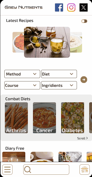
The High Fidelity Prototype for the Mobile View
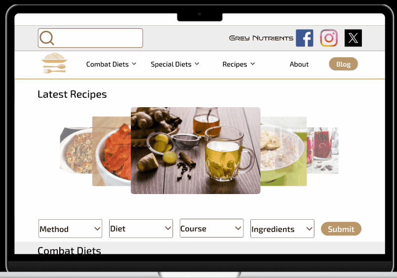
The High Fidelity Prototype for Desktop View
My Role
User Experience
Designer and Researcher
Responsibilities
Conducting Interviews
Building Wireframes
(paper, digital, low and high fidelity)
Organizing sitemaps
Prototyping
Conducting usability studies
Iteration
Tools Used
Figma
Fig Jam
Google Doc
Google Sheet
Google Slides
Timeline
January 7th, 2024
to January 28th, 2024
Techniques Used
UX Laws Application
Design System
(Colors, Typography, Grids, Input Field )
Design Thinking Process
Competitive Audit
User Story, Problem Statement
Goal Statement, User Persona
User Journey Map,
Wireframing, Prototyping
Usability Testing
Summary
The Problem:
1. Older citizens need meals that meet their health and dietary needs, and
2. The need for older citizens to easily navigate the website using different input points at the speed they can manage.
The Pain Points:
1. Navigation - Many diet and menu websites lack comprehensive navigation options, often suggesting meals that don't cater to the limited dietary needs of older citizens
2. Experience - Meal and diet websites typically offer unclear step-by-step instructions or fast-paced video tutorials, making it difficult for users to follow along and pause as needed.
3. Interaction - Users often lack options to specify their food preparation tools, such as one-pot cookware or air fryers, limiting their ability to find suitable recipes.
The Solution:
Design a meal preparation website accessible on mobile and desktop platforms, tailored to provide menus and recipes suitable for older citizens with limited tools. Prioritize user-friendly navigation and clear instructions, ensuring the site caters to their specific dietary and health requirements.
The Journey
This project commenced with secondary research in the form of a Competitive Audit analyzing comparing 3 meal preparation websites for special dietary needs which were Eating Well (Direct Competition), Eat Yourself Skinny (Indirect Competition), and Skinny Taste (Indirect Competition).
- The General Information (Competitor type, Location(s), Product offering, Price, Website, Business size, Target audience, and Unique value proposition)
- First Impressions (Desktop website experience and App or mobile website experience)
-Interactions (Features, Accessibility, User flow and Navigation)
- Visual Design (Brand Identity)
- Content (Tone and Descriptiveness)
For more details on the Competitive analysis, please follow the link - https://docs.google.com/spreadsheets/d/1b10uRa7GNyfbWpcdkg7dUxwTz3anshNlXxc_l8mgWZc/edit?usp=sharing&resourcekey=0-rNhWBg5G4Wnyry4IFKY6jw
Research Questions:
How do you determine what food you are going to eat?
What is most important to you when you want to decide what to eat?
What is your favourite meal and why is it your favourite meal?
What makes a meal healthy for you?
Research Methodology and Recruitment:
10/15 minutes per participants
5 participants - 2 Males, 3 Females between the ages 45 and 70, 5 Nigeria (all remote).
Unmoderated Usability Study
Users were asked to perform tasks initially in a low-fidelity prototype and eventually in a high-fidelity prototype
Understanding the user
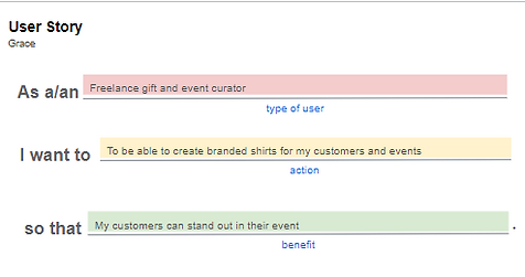
User Story

Problem Statement


Goal Statement

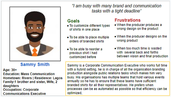
Persona based on research results
User Journey Map

Starting The Design
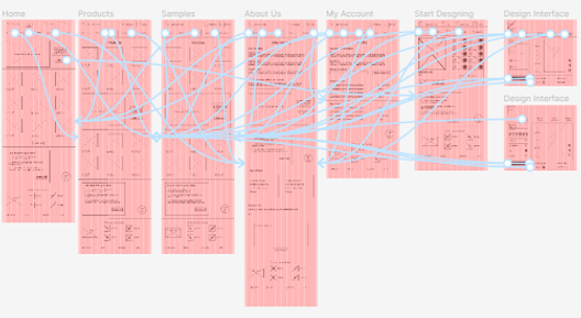
Site Map
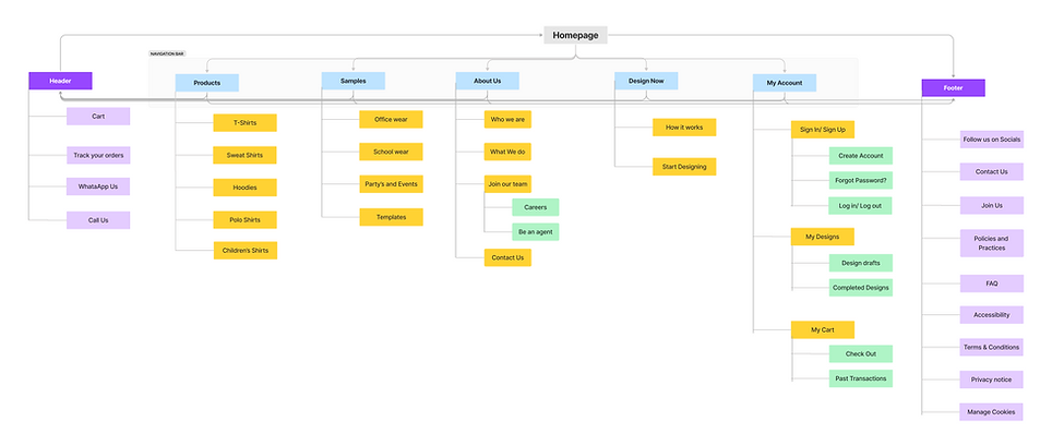
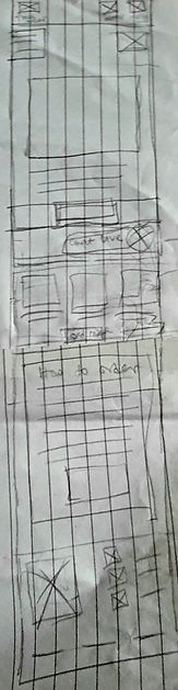
Paper wireframe screen size variations
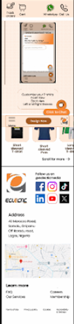
The customers of Eclectic Shirt make use of different devices to access the website as a result I began designing for more screen sizes to ensure that the website is fully responsive
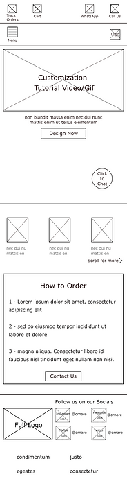
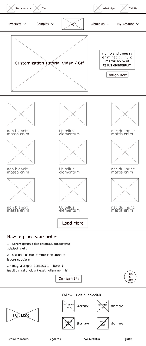
Desktop Paper Wireframe


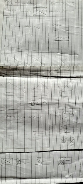
Mobile Paper Wireframe
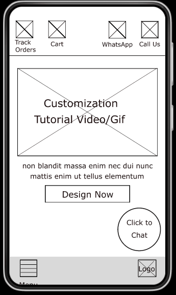
Digital Wireframe
Transferring the paper wireframes to digital enabled me to realise how redesigning could assist in directing the user pain points and enhance the user experience. One of my important strategy was to prioritize the position of useful buttons and visual element on the homepage
Video demonstrating the process of navigating the design page to personalize your shirt.
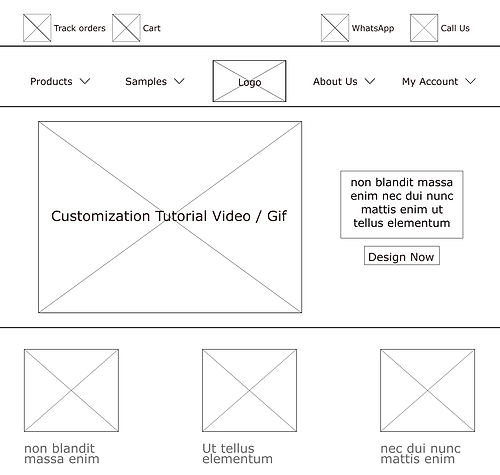
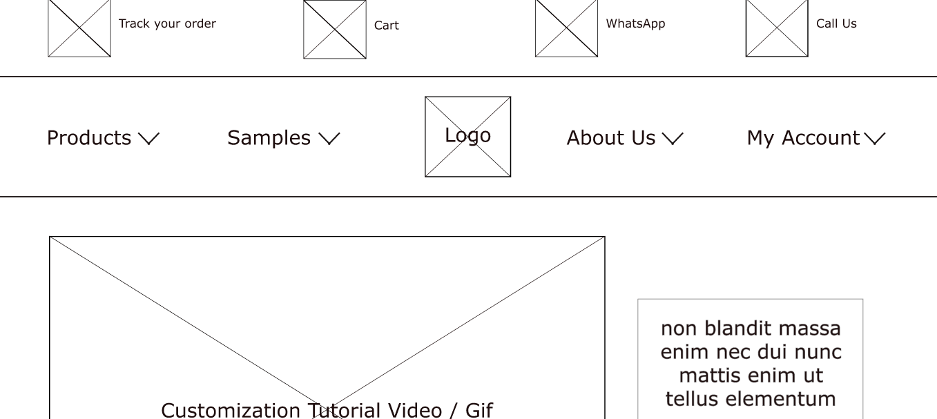
Easy access to menu navigations
Digital wireframe screen size variation(s)

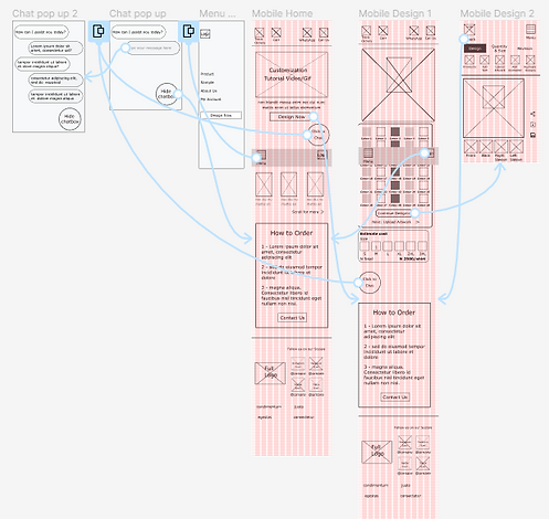
Low Fidelity Prototype
In creating the low-fidelity prototype, all the screens along the primary user flow were linked with the Design page.
At this stage, I got some feedback about the position and the arrangements of the buttons and the pages from my team members, and I ensured I listened to their opinions and applied various recommendations in line with the user's pain points.
Desktop Low Fidelity Prototype
Mobile Low Fidelity Prototype
Usability study: findings
The main findings realized from the usability study are:
01
Chat box
I noticed 2 users did not know that the chat box existed as it was to far down the page
02
Menu Navigation
Asides from the home page, 3 users did not like that they had to go back to the homepage to find the design button
03
Design Page
2 users were hoping to change the style of the shirt on the design page, not just the shirt colour
Refining The Design
Mockups
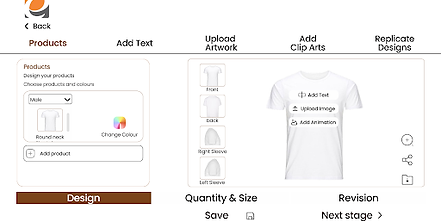
The observation established from the usability study resulted in me making changes to improve the site’s navigation from the home page. One significant change I made was the addition of the Design now button on the menu bar which would allow the user to start the shirt design journey from any page they decide.
Before Usability Test
After Usability Test
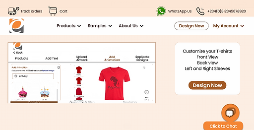
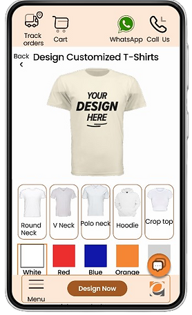
In addition to the color options that users liked, they also wanted to see shirt different shirt styles which expands their vision and the range of options they could choose from
Before Usability Test
After Usability Test
In addition to the colour options that users liked, they also wanted to see shirt different shirt styles which expands their vision and the range of options they could choose from
Before Usability Test

After Usability Test

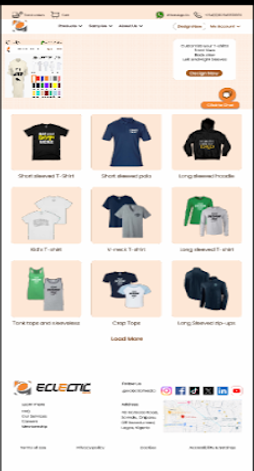
Mockups: Desktop Original screen size


Mockups: Mobile Original screen size


Mockups: Screen size variations
The observation established from the usability study resulted in me making changes to improve the site’s navigation from the home page. One significant change I made was the addition of the Design now button on the menu bar which would allow the user to start the shirt design journey from any page they decide.
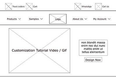
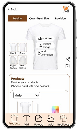
High-fidelity prototype
My hi-fi prototype was improved upon compared to the lo-fi user flow prototype, and optimized design changes were added after the usability study, alongside more changes advised by my team members.


Accessibility Considerations
01
I made use of alt text in the design of the website on all pages for smooth screen reader access
02
I made use of headings with different sized text and colour for direct visual order
03
I made use of standard landmarks to assist user navigation through the site, Especially users who require assistive technologies
Going forward
Takeaways
Impact:
Our target users expressed how easy the navigation of the website was and how innovative the solution to design the website was as it encouraged creativity and possibilities
What I learned:
I learned that users want to see every possible solution available from one look and access them as soon as they need them.
Next Steps
01
There is need to carry out more usability studies especially for the design implementation
02
The site needs more ideation for smooth navigation from the home/ sample pages to the checkout page
03
Dark mode and other languages could be introduced for more accessibility